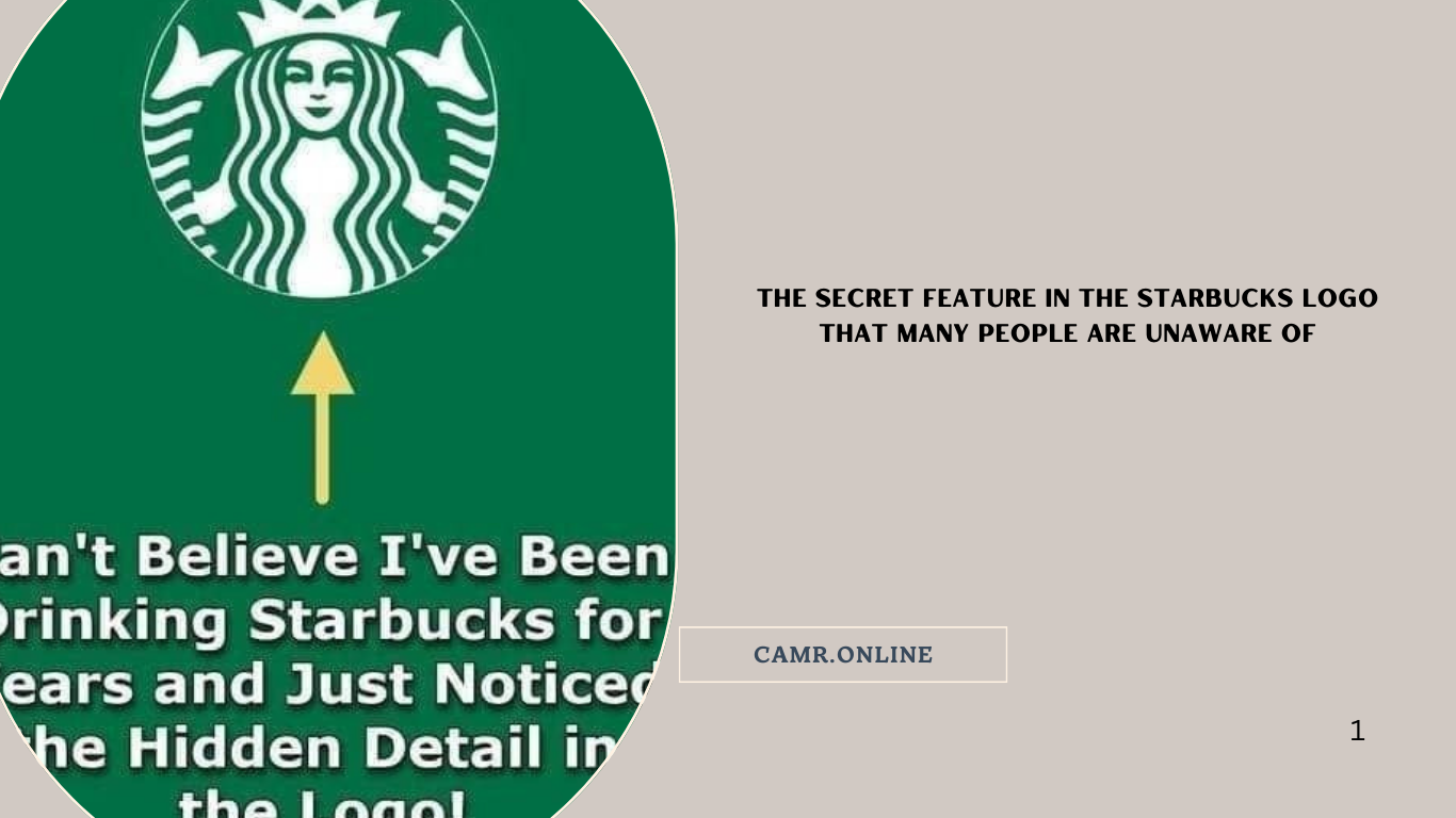
Upon close inspection, you’ll notice that the siren’s face is not perfectly symmetrical. Her right eye and the curve of her nose are slightly different from the left. Additionally, the crown atop her head has small variations on each side. This deliberate imperfection was introduced as part of a redesign in 2011 to make the logo feel more human, approachable, and organic—subtly breaking away from the “perfect” symmetry of many corporate logos.
Why Asymmetry?
The choice to make the siren asymmetrical aligns with Starbucks’ branding strategy to emphasize natural beauty and individuality. By adding these small imperfections:
- The logo becomes more dynamic and engaging to the human eye.
- It reflects the handcrafted, personalized ethos that Starbucks promotes in its products and experiences.
A Fun Design Philosophy
The logo’s asymmetry is a quiet nod to imperfection and uniqueness, resonating with the idea that true beauty lies in the imperfect and authentic. This subtle design element helps the siren stand out while also making the logo feel less “mechanical” and more human-centered.
Next time you sip your favorite Starbucks drink, take a closer look at the siren’s face—you’ll appreciate the artistry and thought behind this secret feature! Let me know if you’d like insights on more logo secrets or Starbucks trivia. ☕✨


